Blog Design for ROI Rule #4: Make Posts Easy to Read
This guest post is by Gab Goldenberg of The Advanced SEO Book.
In the last instalment of the Blog Design for ROI series, I discussed the importance of showering attention on your community using design elements.
The fourth commandment of blog design for ROI is to make your posts easy to read. This ensures that your message gets across even to first-time skimmers, which helps turn them into loyal readers (and post-sharers).
There are several elements that impact on the ease with which a post is read. The primary elements we’ll cover here are:
- a clear starting point and end point
- the number of words per line
- inline sidebars, pull quotes, blockquotes and image captions
- tables of contents (useful mainly for long posts)
- author credits.
Each individual blog post should have clear start and end points
The web 2.0 design trend contributed positively to web design practices in this regard, as it led many people to show rounded-corner graphics at the tops and bottoms of blog posts.
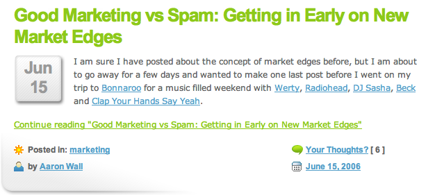
In itself, the roundness or squareness of the corners doesn’t matter. It’s the presence of the corner graphics that matters, because they indicate the beginning and end of the post.
You can see bottom-corner graphics in this old design of SEOBook.com’s blog:
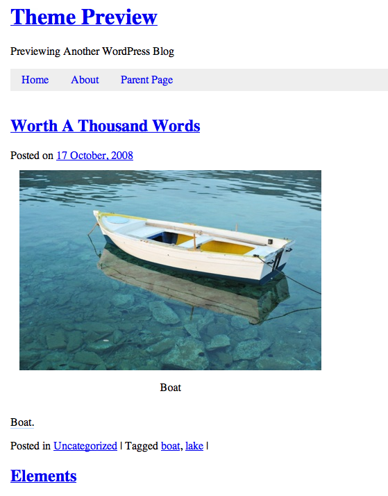
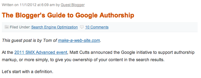
In contrast to the above, it’s hard to distinguish where posts in WordPress’s Toolbox theme start and end, for lack of such graphic hints. Toolbox Theme, pictured below, uses large-font blue text links to show that a new post is starting.
If you didn’t know the site was a blog, though, you wouldn’t necessarily know that the links were the start of new posts, as I discovered in usability testing. Also, the blog’s name is only a little larger than the post titles. Using corner graphics clearly makes it easier to know when a post starts and ends.
That being said, the date, post categories and tags do help to distinguish the start and ends of posts. (And kudos to this theme’s designers for avoiding the calendar date icons, which are just distracting graphics.)
I’m not saying Toolbox is bad, it’s just that there’s an important improvement possible here. The flip-side is that the Toolbox theme gets some advantages from this light use of graphics, like fast loading times.
Line length and font size
Just as some forms of print are easier to read, so too it’s easier to read some particular text layouts online. For blogs, this means somewhere between 12-16 words per line, with about 12-point type.
Obviously this will vary a bit if you choose to accomodate older readers who typically prefer larger type (13 point of 14-point font sizes), but this rule is a good starting point.
Look at the legibility of my SEO blog‘s design in terms of the number of words per line, in the next image. There are a lot of words—20-22 words in each line!
In contrast, you’ll find that Problogger has 12-15 words per line.
These shorter lines are a lot more manageable and mentally rewarding, as readers feel that they are making progress more quickly.
It’s similar when kids choose a book with a large font and wide margins for their book report, so they can have done their homework (reading the book) in less time.
Besides your default post width and font size, which will determine post design, certain graphic elements also help readers speed through posts—and enjoy and understand them more…
Post-embedded sidebars, blockquotes, pull quotes, and image captions
Our blog posts need to be visually appealing not for the sake of art, but to help break up large sections of text into more manageable, bite-size pieces.
Pull quotes and blockquotes
Pull quotes and blockquotes, as well as post-embedded sidebars, help shorten some of the lines in your posts. This helps the reader feel like they’ll get through the post quickly.
Pull quotes are those quotes that appear on the side of a main block of text, and highlight an important quotation. (This also makes them a text tidbit, which I’ll discuss more below.)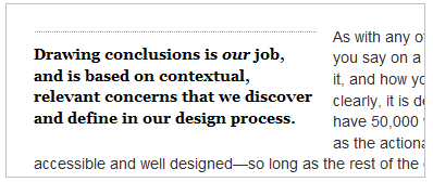
In this, pull quotes are different from blockquotes, because blockquotes are typically complete paragraphs that are part of the main column of text. Smashing Magazine does a good job explaining the details of different quote types.
Blockquotes shorten a line by being indented, as you can see with the yellow line to the left of the content below.
Post-embedded sidebars
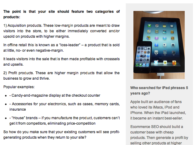
Here’s what a post-embedded sidebar looks like (see the right-hand side of this picture), for those who haven’t yet seen one.
Do you see how the sidebar makes the main body of text narrower? This lets people to get through each line faster. It’s important also that the sidebar has a distinct appearance thanks to its grey background color. (You could use a border instead.)
Note: A post-embedded sidebar is different from the blog’s main sidebar.
The post-embedded sidebar offers information related to a specific post, such as biographical information on a person being interviewed, or background context on a story. The main sidebar is unrelated to a specific post and offers general information and navigation for the site overall.
Text tidbits: subheaders, bullets and image captions
I call these elements “text tidbits,” as they’re the little bits that get read most—they’re read by regular readers but also by skimmers who may skip other content, so that these tidbits are worth spending time on.
Since image captions are very highly read text tidbits, it’s important that blog themes include a caption element—even the basic grey background that is the default in WordPress.
In my personal experience, custom theme designs often forget to include a caption element. Words typed into the caption area of WordPress’ image uploader appear out of place, if they appear at all. This means visitors read fewer words, lowering the chances that they will become loyal readers.
Tables of contents
If you’re writing a long post with many sections, readers will find it useful to preview what the sections are. This way they can pick and choose what interests them.
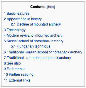
Wikipedia of course, is the master of this technique:
The question of whether to follow Wikipedia’s approach of placing the table of contents as its own unique paragraph in the main body of text (as opposed to having the text wrap around it), is debatable.
On the one hand, this placement achieves the introduction’s goal, telling us what is to come. And this placement’s visual weight promotes use of the table of contents. On the other hand, a table of contents around which the main text wraps may prove less obtrusive while still communicating its point.
The answer to this question depends in part on the rest of your design, and so informal usability testing is the best way to choose which alignment option to choose.
Author profile information
It’s debatable where post authors should get credit for the post, but this matters both for new blogs and for blogs looking to encourage guest posting. On the one hand, leaving the bio to the end of the post rewards authors less—not every reader will read to the end. But placing too much content at the start of a post can be annoying for readers.
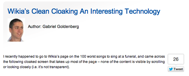
I’m in favour of a balanced approach: reward authors by showing the author’s photo and a one- or two- sentence bio with links at the start of a post. Then place a more expansive bio at the end for people who really must find out more.
The Fanciest Author Box plugin is an elegant way to create the more expansive bio:
The balanced approach benefits both the post author and the blog owner. When visitors see a respected, familiar face at the start of a post, they’re more likely to stay and read. And as I mentioned before, the use of images (regardless of what exactly they are) lightens a post and makes it more readable.
Blog post design pointers
When choosing graphic design options for your post, always aim to facilitate a quick read that will fully express your message. The more they absorb your message, the better for you and your blog’s ROI.
- Ensure people know where one post ends and the next starts, so that readers scanning homepages and archive pages can easily choose a post to read.
- Keep the line length down to 12-15 words to help visitors read more. Occasionally, make lines even shorter with some attractive pull quotes, sidebars, and blockquotes, as this helps move readers through your post.
- When writing long posts, offer a content preview in the form of a table of contents. That way people know if they’ll read something of interest from the very beginning.
- Post author credits are an important reward for encouraging guest posts, so share some love at the start—but save the whole personal bio for the end.
How does your blog post design stack up against these guidelines? Share your thoughts in the comments.
Gab Goldenberg wrote The Advanced SEO Book – and you can get a free chapter here. Gab and Internet Marketing Ninjas, the folks behind the Blog Design for ROI series here on Problogger, are offering to mail you a free print copy of the Blog Design for ROI guide as a small book. Get your free copy from seoroi.com/blog-design-for-
Originally at: Blog Tips at ProBlogger

Blog Design for ROI Rule #4: Make Posts Easy to Read
Source: http://feedproxy.google.com/~r/ProbloggerHelpingBloggersEarnMoney/~3/nmVkBPXaPgQ/
a wealth of knowledge can be found here site related to this search engine marketing small business marketing



0 Comments:
Post a Comment
Subscribe to Post Comments [Atom]
<< Home