Blogging in Brief: Looking Good, Saving Face, Tags and Lags
We all make mistakes, but making mistakes in the media can be costly—especially to your authority!
…Or can it? We all know readers appreciate honesty. And our first story this week is all about that.
Saving face online
Last week, I got my regular flippa.com newsletter … and another a few hours later! The new subject line? “Our newsletter, now with functional links!”
Intrigued, I opened it to see this:

Way to save face after a blooper! If you’ve ever had to apologise for an error you’ve made publicly, online—perhaps even on your blog or with your valued subscribers—we’d love to hear how you handled it in the comments.
Big-block headers revisited
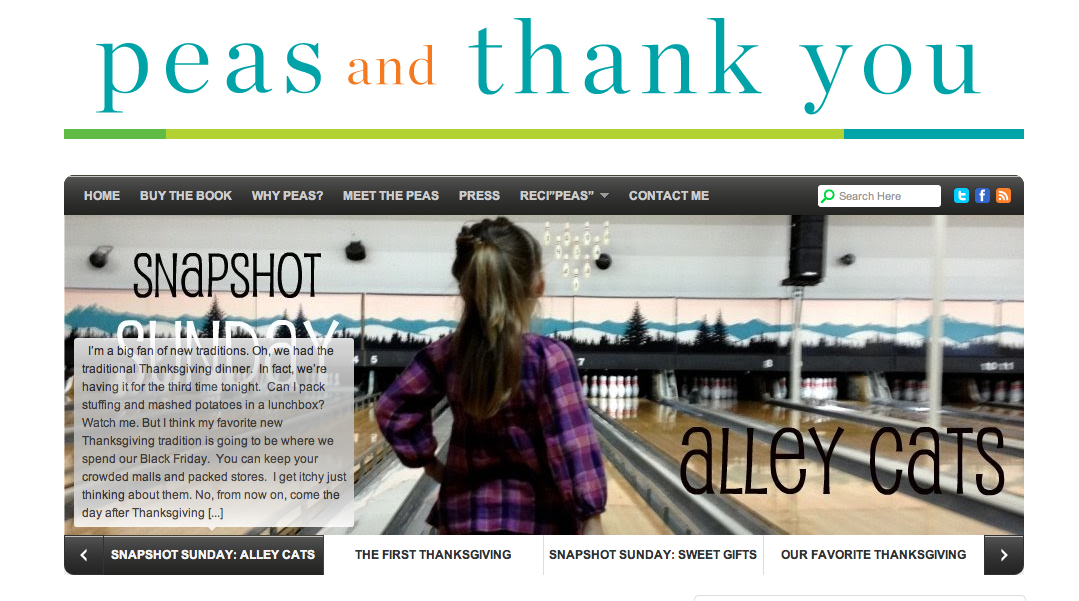
I mentioned last time the growing trend toward big-block header on blogs. This week, I found one that acts simply to pull you through to the latest content, on food blog Peas and Thankyou.
This screencapture shows the header on rollover—the opening of each post appears as an overlay on the header. This is a great use of imagery I think, and an excellent way to catch the attention of readers, especially those who are arriving for the first time. On dPS, I use a similar carousel for featured content, but it’s not simply for the latest posts. It really brings attention to your current content.
What do you think of this idea? Could this work for your blog?
Name your own price
The battle to find the best price for a blog product—one that maximizes your profit—can be hard to do. So the approach of letting customers choose their own price is an interesting one. Tara Gentile uses it on her blog:
The product is designed to change customers’ relationship with money, so the tactic is in keeping with the concept.
It’s an interesting tactic, and not one I’ve tried. Have you? How did it work? I’d love to hear of your experiences in the comments.
Are your promotions slowing your site?
Many blogs show a popup on page load for first-time users—perhaps offering a download, subscription, or other goody.
But this week I’ve stumbled across a few that are really extremely slow to load as a result.
One of them flashed up the homepage before hiding it—so the screen was blank—for what felt like ages (but was probably 5-10 seconds) before displaying the popup. The popup itself didn’t have the usual close button in the right-top-corner, either, which meant that after the long wait, I had to spend more time trying to work out how to close it so I could access the site content. That finally appeared only once I’d found the Close window link.
Every time you add a new widget, plugin, or promotion to your blog, test the load times for different browsers to make sure your blog’s still accessible and usable for everyone who stops by.
Do tag clouds still matter?
Remember tag clouds? They were popular a few years ago, but they seem to have fallen out of favor now—though I notice the Blog World blog still has one:
Tag clouds can help users drill down to specific content that isn’t represented in your basic blog navigation, and to reach content in your archives that spans topics. In fact, in some cases it’s a great way to provide users with access to your older material. That said, I don’t use tag clouds—basically because screen real estate is so precious, and a tag cloud never really makes the cut onto my sites.
Are you using a tag cloud? How’s it working for you? We’d love to get an idea of whether you think this mechanism is still relevant to the blogs of today.
Originally at: Blog Tips at ProBlogger

Blogging in Brief: Looking Good, Saving Face, Tags and Lags
Source: http://feedproxy.google.com/~r/ProbloggerHelpingBloggersEarnMoney/~3/QppvQcbwkVA/
suggested resource Bring the Fresh OMG Machines Reviews of Internet Marketing Products


0 Comments:
Post a Comment
Subscribe to Post Comments [Atom]
<< Home