Blog Design for ROI Rule #6: KISS Headers, Navigation, and Sidebars
This guest post is by Gab Goldenberg, author of The Advanced SEO Book.
This post is the sixth in a series on blog design for ROI. Previous posts in the series were:
- Prioritize the Optin Form
- Highlight Your Key Content
- Show Love To Your Community
- Make Posts Easy To Read
- Engage Readers on Archive Pages Fast.
One area that blog designers regularly get wrong is the design of secondary elements, and I should know, since I made the error myself.
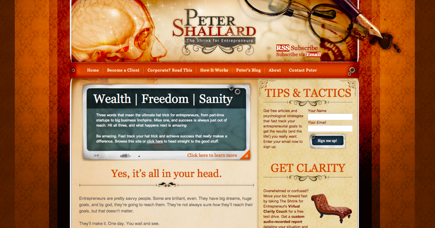
In this 2008 screenshot of my blog, the header, sidebar, and navigation are roughly as loud as a drunk protesting he shouldn’t be thrown out of the bar. Maybe louder!
Not only was my sidebar loud, but the ample whitespace in the header drew attention to my slogan. At the same time, the dark contrasting background I’d used for my main navigation and breadcrumb trail drew eyes there.
There was no clear focus to the design at all.
You might think that this was an accident, that I wouldn’t have made such a loud sidebar if I’d known better … I wish. Really, my idea was that having a prominent sidebar would allow me to periodically try different marketing messages there in order to gain more business. Similarly, I wanted people looking at and clicking on the navigation since the pages listed there were sales-oriented.
Considering the popularity of widgets (typically styled sidebar boxes like the one above) in the world of WordPress blog design, I’m probably not the only one prioritizing the sidebar over the main content.
So today’s rule really just has a simple message for myself and my fellow business bloggers.
Keep It Simple, Sam: the KISS rule applied to blog headers, navigation and sidebars
Simpler headers
Takeaway #1: Don’t distract visitors with big logos and branding. Either offer an opt-in form in that space or just tone down the branding and move your content up vertically.
Surprise! People’s top priority in visiting your blog is not to admire your logo and branding, nor the sidebar and your awards. It’s not even to click around your navigation.
Your visitors’ number one priority is to read your content.
What do many of us do? We load up large header graphics and massive logos, which not only push our content further down the page, but also distract the eye and brain from their goal:

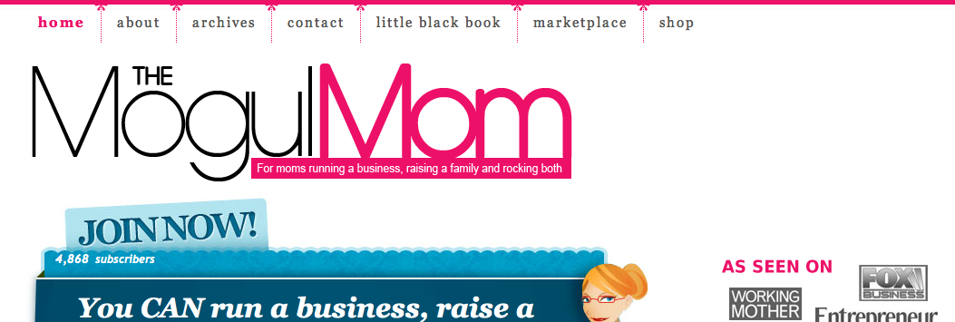
A mega-sized logo takes pride of place at MogulMom – but she’d be even more successful than she is by scaling down her logo
Of course, this delaying and distracting of readers with large branding graphics is counter-productive. Why?
It’s a waste of space to use XXL branding, because we could instead prioritize the email signup form, which definitely feeds our long-term audience growth.
Another reason is that we want visitors to start reading fast, so we can maximize repeat visits and build our audience.
Simpler sidebars
Takeaway #2: Don’t distract visitors with long blogrolls, loads of award badges and other unruly sidebar features.
Keep the sidebar’s visual weight secondary, and minimize the clutter.
Chances are that your awards and reads you enjoy are not directly relevant to the specific post somebody has loaded or to the given archive page, let alone the About Us or Contact pages. So why not move the blogroll, category and tag links to their own separate pages?
Have a page with links to your favourite blogs. Add another page to serve as a general archive clearinghouse with links to each category and tag page.
What should you feature in your sidebar instead?
- Earlier in this series I discussed the importance of showing attention to your community. The sidebar is a good place to do that.
- You can have widgets that highlight related content (e.g. tag-based) as well as popular content from the same category the post is in. This personalizes or contextualizes the content suggestions, which most readers appreciate.
- 3. Write an About page summary in the sidebar.
And what about subscription calls to action?
As I mentioned earlier, it’s best to place these in visually prominent areas above and below the main column rather than in the sidebar. If that’s not possible, then the sidebar is the next best place.
Think of your sidebar as a complement to your post, and you’ll be more successful than if you see the sidebar and post as competing for attention.
Simpler navigation
Takeaway #3: Your primary menu has a place on every page … but a secondary place.
Remember how my blog’s menu drew attention to itself with rich colours, instead of helping eyes rest on my content?
Learn from my mistake and keep your navigation’s visual weight secondary. A light grey or white background will do, and the breadcrumb navigation really does not deserve to be at the center of things, much less to have a highlighted background.
For more on visual hierarchy, see this great post on Search Engine Land and this one on the 4 degrees of visual hierarchy in wireframing.
Keep it simple!
The massive header branding does far less for you than either getting the visitor to join your newsletter or read some content—so use your space accordingly.
To the same effect, reading post content is more important than clicking links in the main navigation, blogroll, or discovering the admiration some other group has for your blog. Making the sidebar visually loud makes it harder for people’s eyes to read the post normally.
Keep it simple and watch your readership grow!
Gab Goldenberg and Internet Marketing Ninjas are developing a book based on this series – get your free copy at http://seoroi.com/blog-design-
Originally at: Blog Tips at ProBlogger

Blog Design for ROI Rule #6: KISS Headers, Navigation, and Sidebars
Source: http://feedproxy.google.com/~r/ProbloggerHelpingBloggersEarnMoney/~3/-y8c2CcYeAk/
go here for additional information relevant site related post Here is a site that might also catch your interest


0 Comments:
Post a Comment
Subscribe to Post Comments [Atom]
<< Home